Qinaps
DATE
May - June 2023
PLATFORM
SaaS platform
MY ROLE
UX/UI designer
DATE
May - June 2023
PLATFORM
SaaS platform
MY ROLE
UX/UI designer
Making a dense B2B tool meaningfully clearer, without touching a line of its structure.
PLATFORM
SaaS platform
DATE
May - June 2023
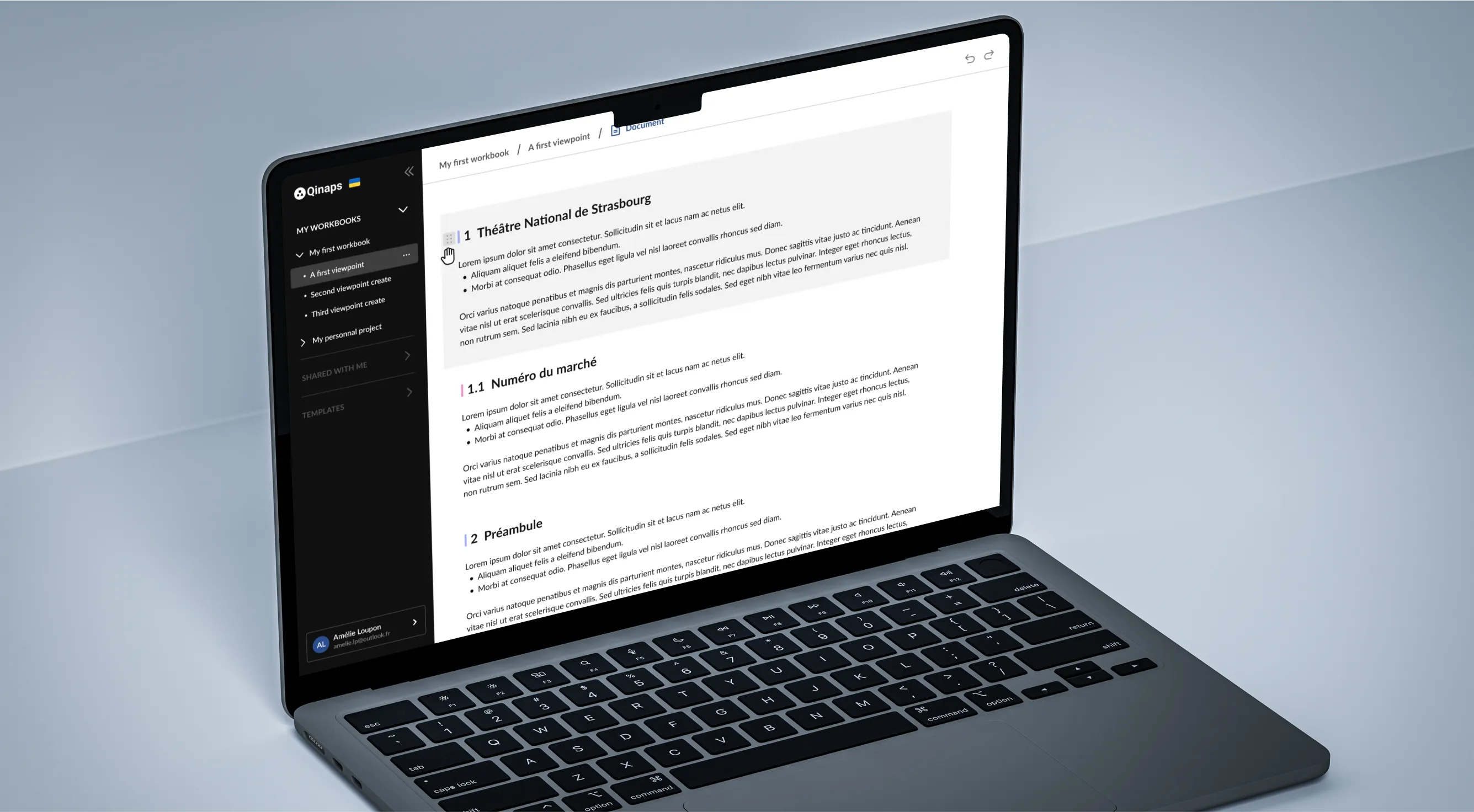
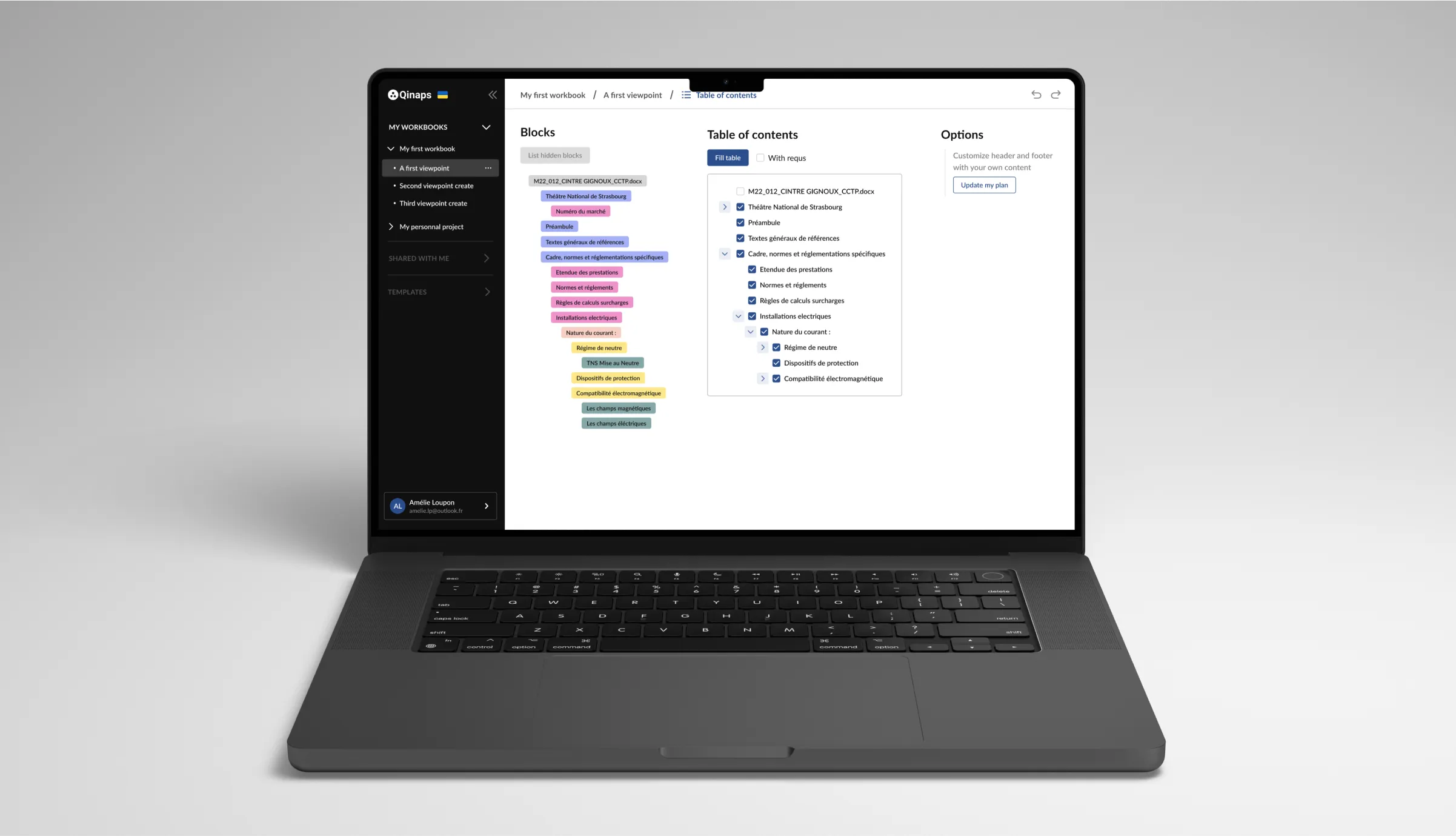
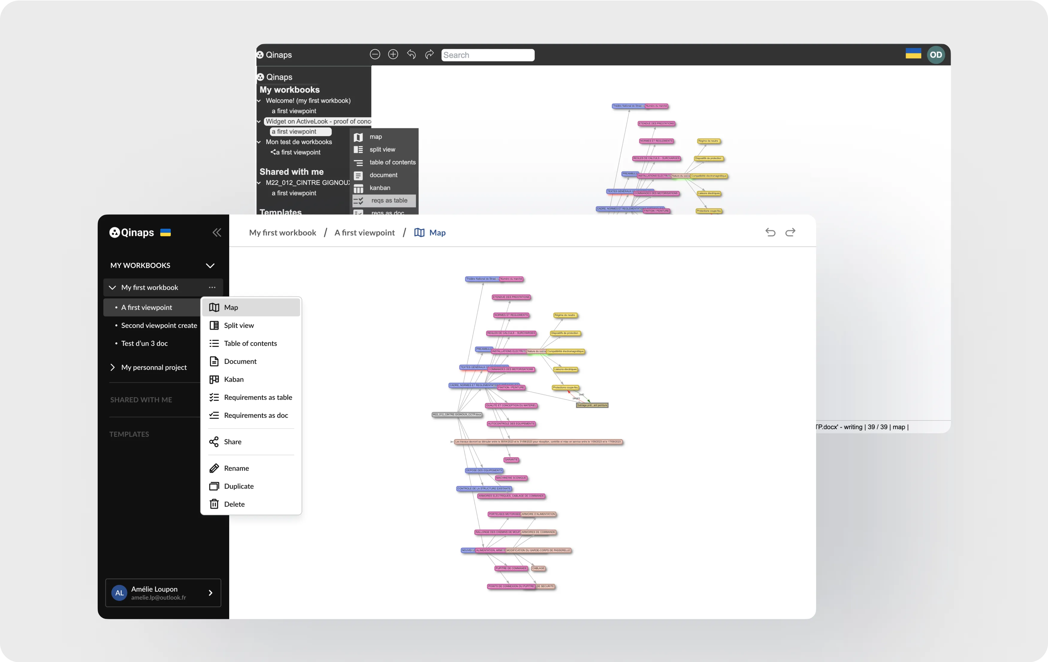
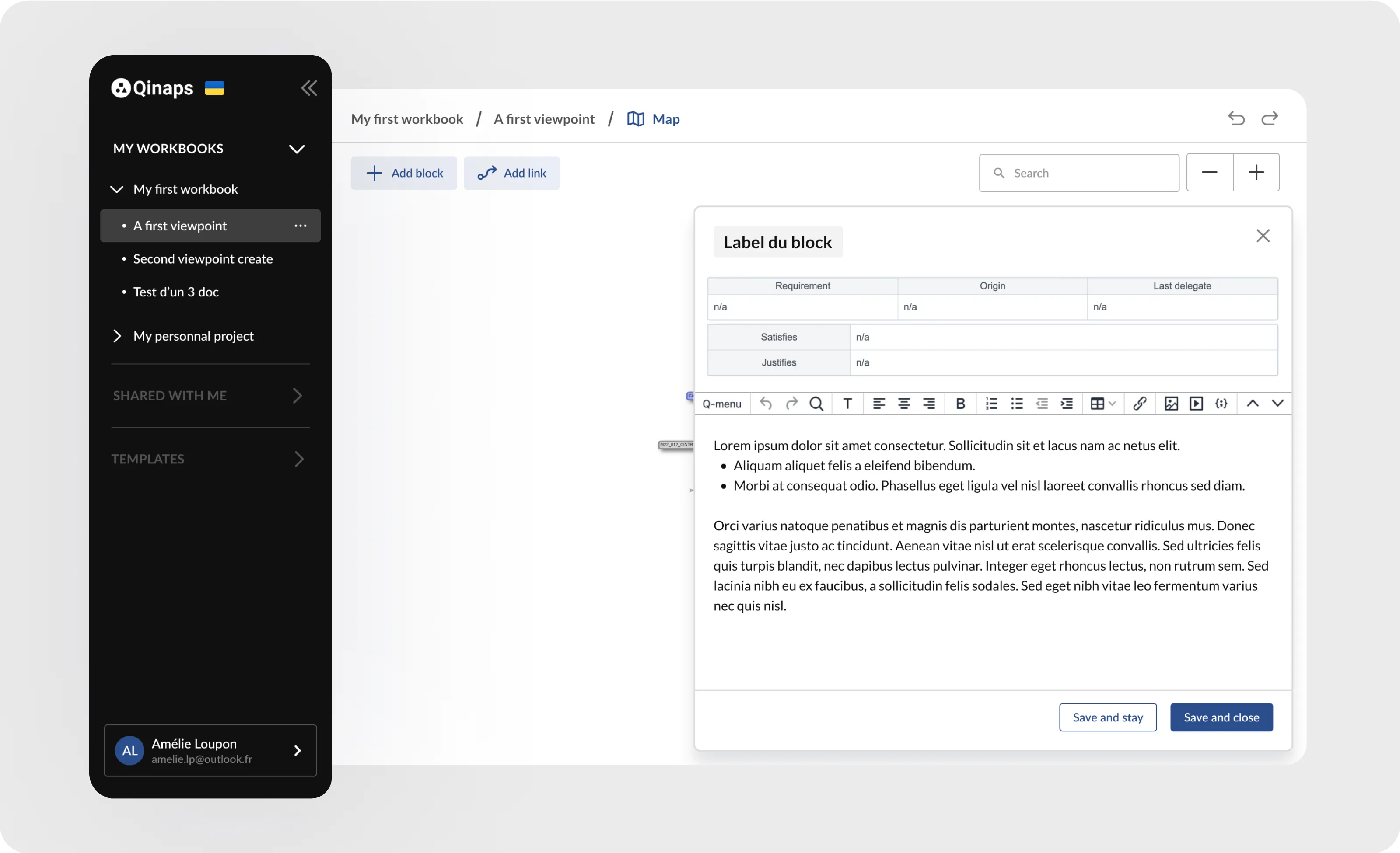
Qinaps is a B2B SaaS platform for building structured documents: workbooks made of content blocks, organised into viewpoints, with a map view, a Kanban, and requirements tracking. They brought us in to make it easier and more coherent to use, under one hard rule: front-end only, no changes to the architecture. I delivered a developer-validated roadmap that made the product feel like one coherent tool, without touching a line of its structure.
CLIENT
The founder and president of Qinaps is an artificial intelligence expert and entrepreneur with significant experience in leading international companies. He has led global scale companies and collaborated with governments and industry.
CONTEXT
The brief came with a strict constraint. We couldn't touch the structure of the code or the layout. Everything I proposed had to live on the front end. So the question wasn't "how would I rebuild this." It was "what are the changes that improve the experience the most, for the least code, and how do I prove which ones are worth doing."
I led the design audit and the recommendations, working with one developer. I evaluated the product, mapped the experience, prioritised the problems, and turned them into a realistic plan we could actually ship inside the constraint.
THE REAL CHALLENGE
The product worked, but it didn't feel like one coherent tool. Spacing and colours were inconsistent from page to page, the same kind of element was shown two different ways, and several important actions were buried in right-click menus or only appeared on hover. Users couldn't always tell which view they were in.
I couldn't fix any of that by restructuring it. So the whole challenge was leverage: finding the small, front-end-only changes that would add up to a product that feels consistent and legible, and making sure every change I recommended was actually worth building.
I went through the product end to end as a user, then built an experience map across its four main phases: initialising a document, managing sub-sets, managing requirements, and collaborating. For each phase I laid out the user's goals, their actions, the emotional highs and lows, what already worked, and where it broke. That turned a vague "make it better" into a concrete, ordered map of exactly where the experience was failing and why.
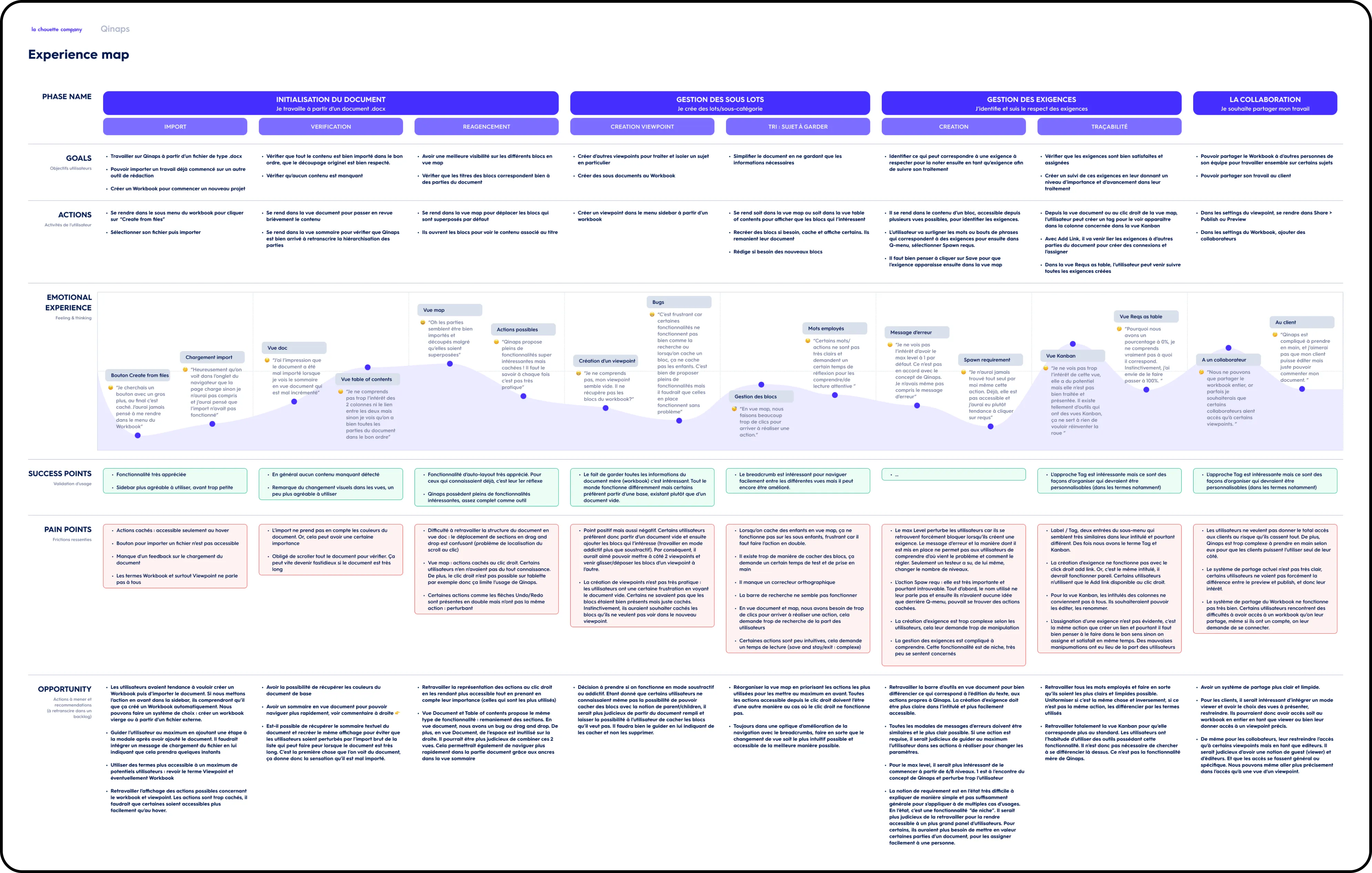
Not all the issues were the same shape. Some were ergonomic and structural: hidden actions, no way to tell which view you were in, awkward navigation. Others were visual: inconsistent spacing, an incoherent set of icons, colours that weren't systematised, two different modal styles. I split the recommendations into UX/ergonomics and UI, and prioritised within each, so the client could see the difference between "this confuses people" and "this looks unfinished."
This was the decision the constraint forced, and the one I'm most happy with. A list of improvements is useless if half of them are too expensive to build. So I ran a working session with the developer and weighed each recommendation on three things: how important it was to users, its priority, and how much it would cost to implement on the front end. That session is what turned a wishlist into a realistic, ranked plan that respected the no-structural-change rule.
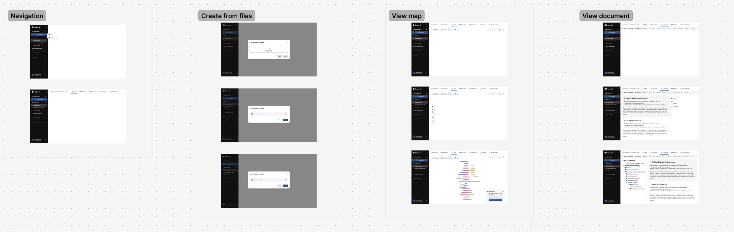
With the plan agreed, I focused the changes where small effort bought real clarity. The main ones:
None of these touched the architecture. Together they make the product feel like one tool instead of several.
I'd loop the developer in earlier, while still mapping the journey, instead of after drafting the full recommendation list, so cost constraints shaped the audit from the start.
I delivered a full experience map, prioritised recommendation boards, and a developer-validated plan that fit inside the front-end-only constraint. Because every recommendation was weighed with the developer for impact against build cost, the client didn't get a wishlist, they got a realistic, ranked roadmap of changes that make Qinaps more consistent and easier to navigate without re-architecting anything.
 Flightlog
Slack
Flightlog
Slack