Libden
DATE
April - July 2024
PLATFORM
Webapp
MY ROLE
UX/UI designer
DATE
April - July 2024
PLATFORM
Webapp
MY ROLE
UX/UI designer
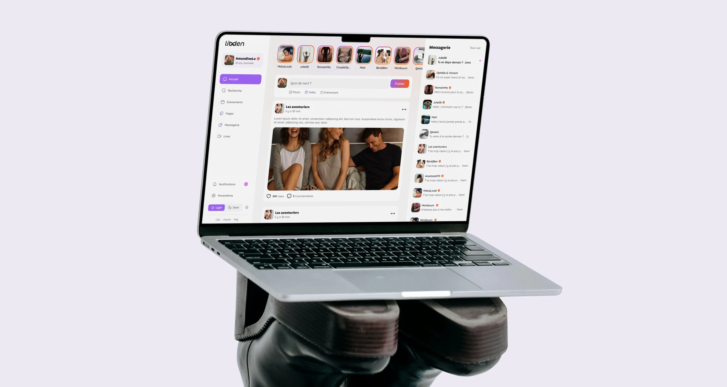
Libden is a responsive social network designed for a community that values privacy, trust, and discretion, offering a space to meet and exchange adapted to their needs.
PLATFORM
Webapp
DATE
April - July 2024
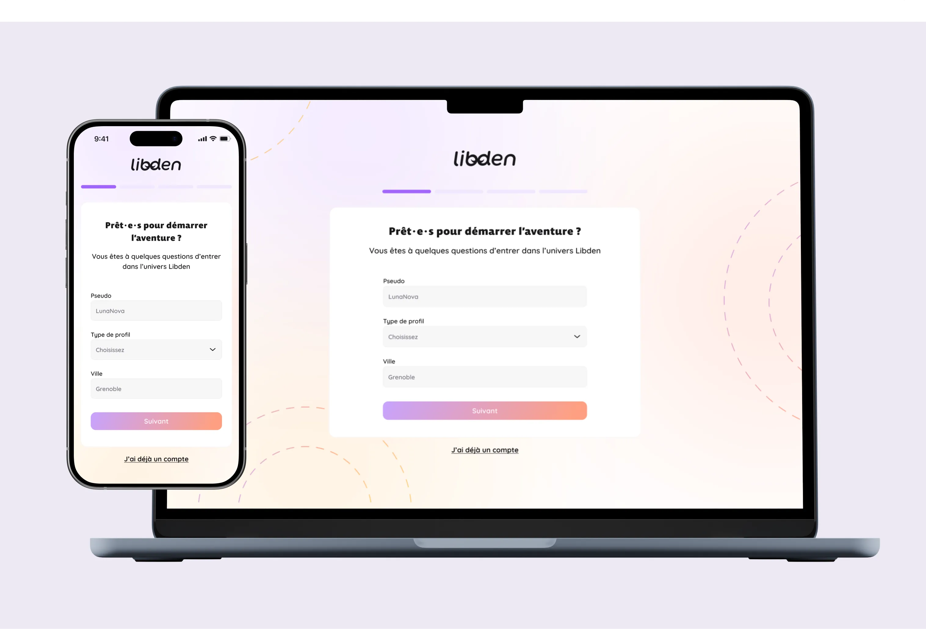
Libden set out to replace the outdated, poorly-maintained platforms serving its niche dating community. I took the rebrand and the web platform from 0 to 1, and the client brought me back on a freelance basis after delivery to keep building on it.
CLIENT
The client, a member of this community himself, created Libden to meet a need: offering a modern and inclusive platform, designed by and for the people who use it. Dissatisfied with existing options, he wanted to design a space that combines ergonomics, respect, and authenticity, where the community can fully thrive.
CONTEXT
This project aims to assist the client in designing his digital tool, starting with a rebranding of the visual identity. Then, with the web interfaces, the objective is to integrate innovative features to enrich interactions and facilitate encounters within the community.
As part of this project, I took charge of the entire mission in total autonomy. I was in direct contact with the client throughout the process, playing a central role in strategic and creative guidance.
PROBLEM
The Libden project was born out of the client's frustration with the obsolescence of existing social platforms serving this community. Using a well-known social network in this field, he noted a blatant lack of updates, recurring bugs, unfinished or underdeveloped features, and a glaring lack of inclusivity. Drawing on his personal experience and feedback from his acquaintances, the client decided to create Libden.
SOLUTION
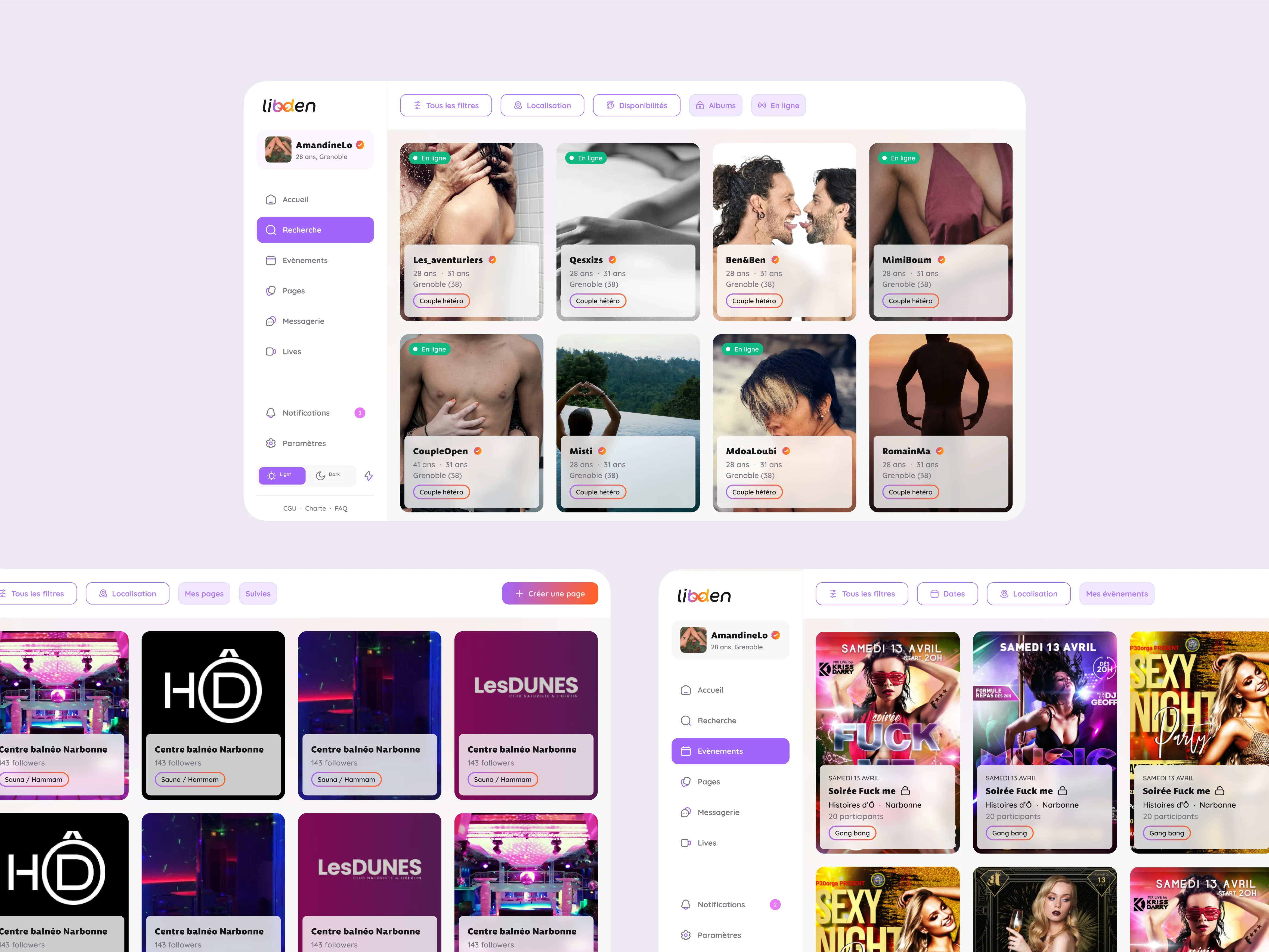
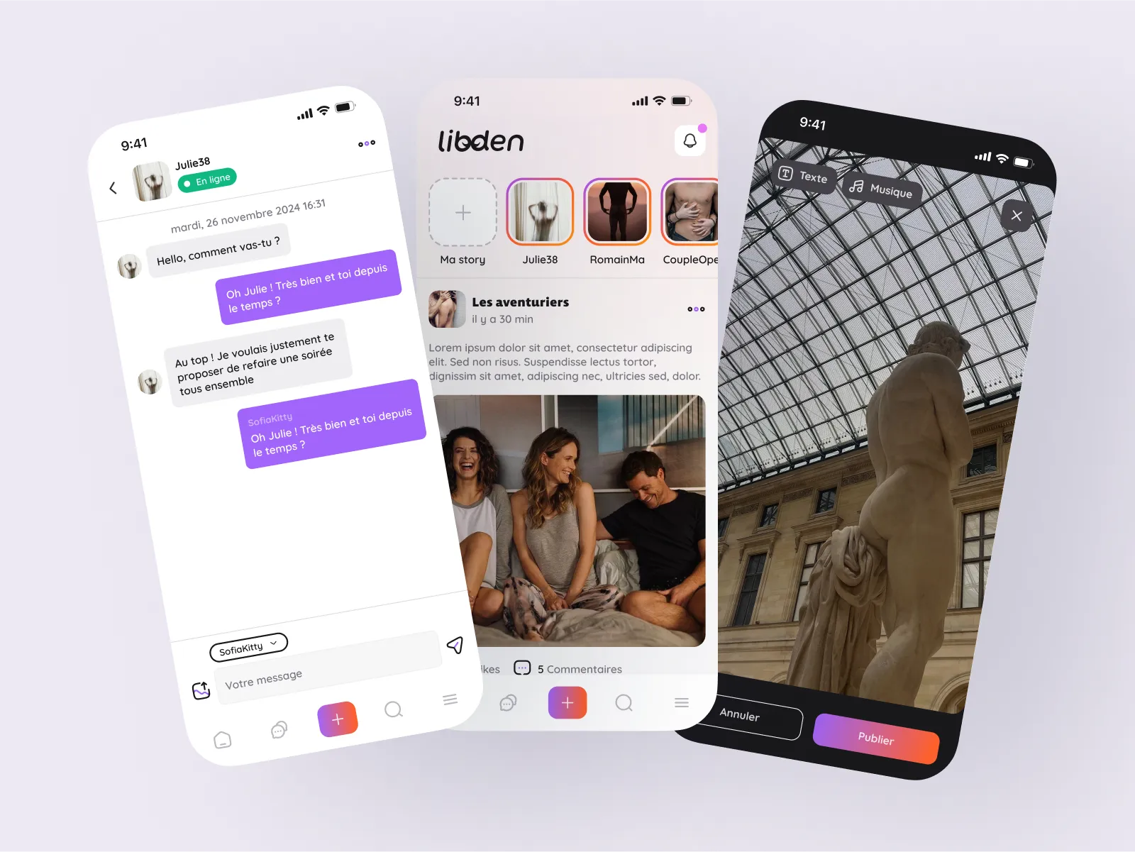
We designed a platform rethought from start to finish, putting the user experience at the heart of the project. The goal was to offer a modern, fluid, and intuitive alternative, with a polished interface and innovative features. We emphasized inclusivity, reliability, and optimizing social interactions, ensuring an engaging and differentiating experience compared to existing platforms.
I presented three distinct creative directions built on the client's existing logo, each with its own color palette, icon set, typography, graphic pattern, and custom illustrations. The client picked the direction that best matched four named criteria: fun and welcoming, codified to the community, safe and reassuring, and chic/classy in line with the platform's premium image.
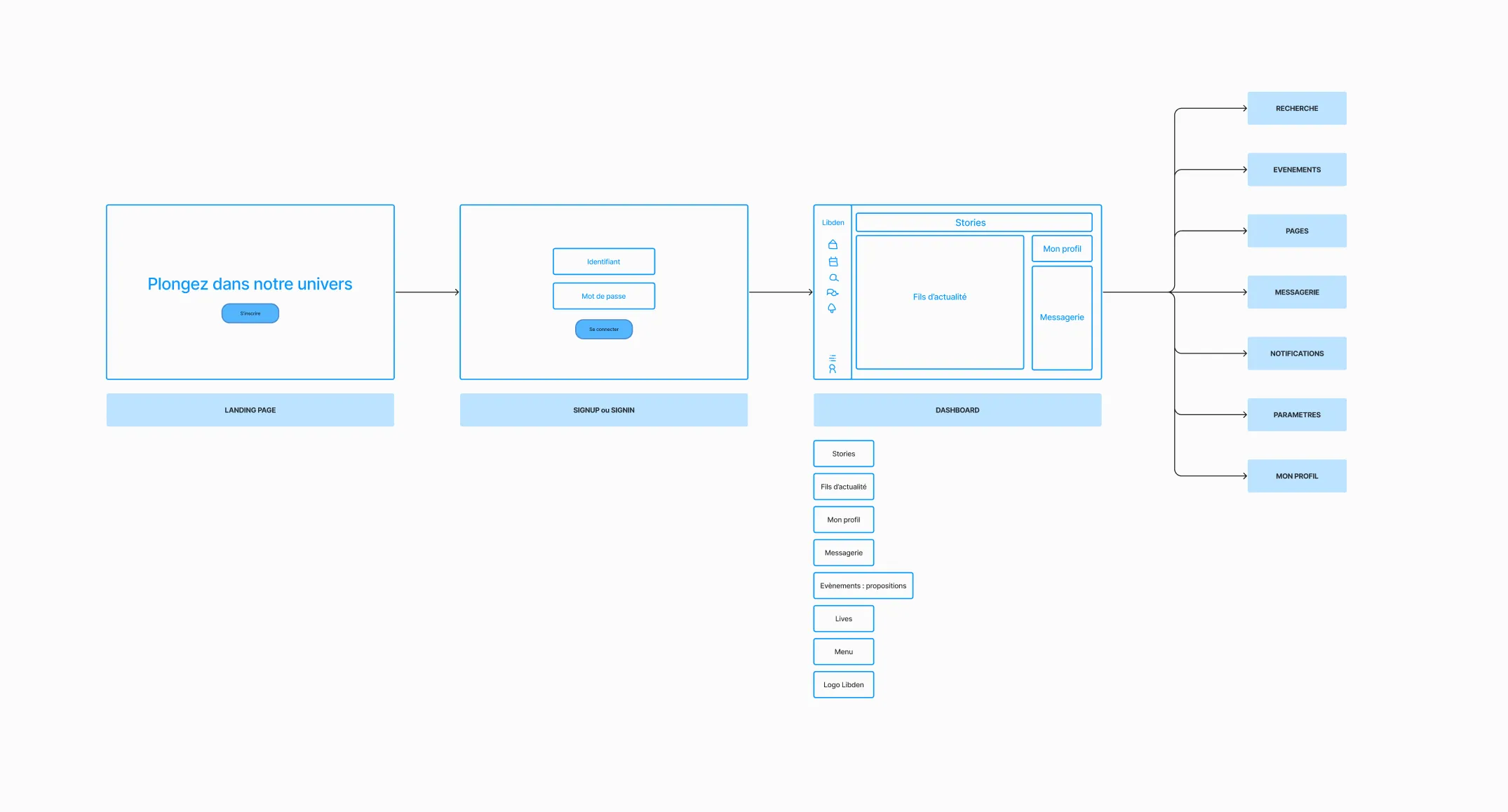
With limited time and budget, we cut the mid-fidelity wireframing phase. After the workshops defined the key features and layout, I sketched the userflow and very low-fidelity screens, then jumped straight to a high-fidelity prototype of the homepage to lock the direction, before extending that same high-fidelity approach to the rest of the platform.
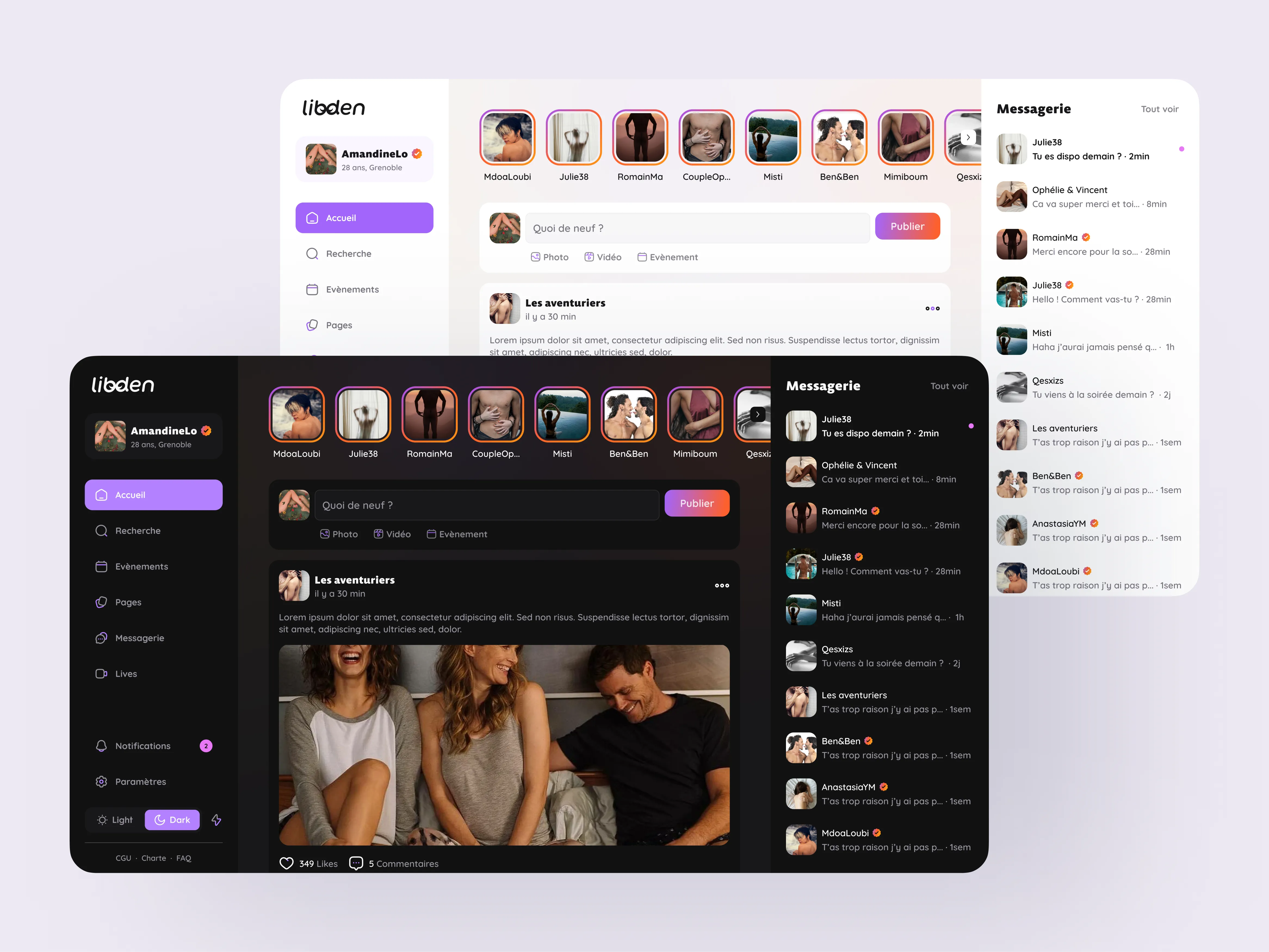
The client had already started the visual identity by creating a logo. My role was to build on these foundations to develop a complete and coherent visual universe capable of supporting Libden's brand image.
After reviewing the three proposals, the client chose a direction that perfectly reflected the universe he wanted to recreate. Four main axes guided this choice:
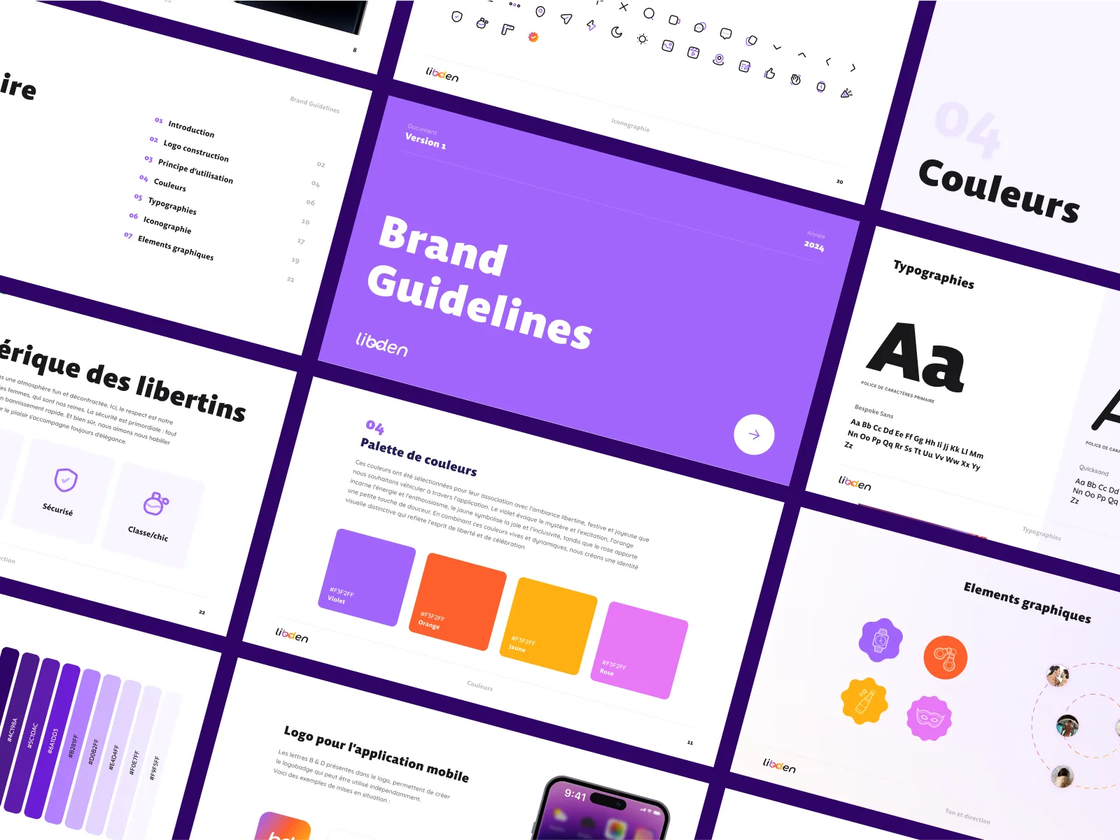
Based on this direction, I created a comprehensive Brand Guidelines document. This document serves as a reference for all of Libden's visual communication and also guided the design of interfaces and future communication materials.
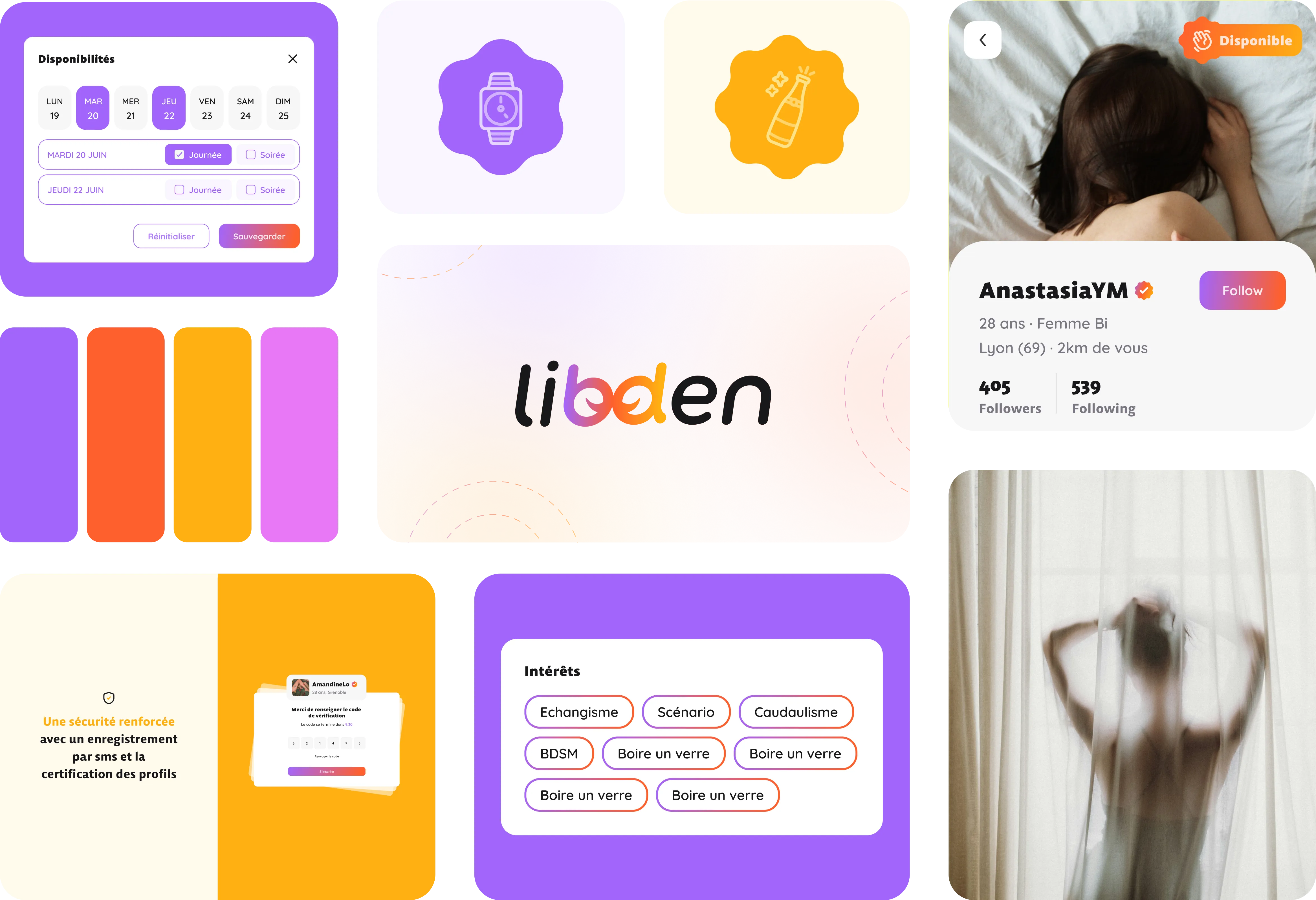
Choice of bright colors: mystery, energy, joy, softness.
These colors were selected for their association with a festive, joyous, and open-minded atmosphere we want to convey through the application. Purple evokes mystery and excitement, orange embodies energy and enthusiasm, yellow symbolizes joy and inclusivity, while pink adds a touch of softness. By combining these bright and dynamic colors, we create a distinctive visual identity that reflects the spirit of freedom and celebration.
Bespoke Sans for headings & Quicksand for body text
Bespoke Sans was chosen for the headings thanks to its modern and assertive design, which conveys elegance and professionalism.
For body text, Quicksand was preferred for its rounded shapes and high legibility, bringing a warm and accessible touch.
This typographic combination ensures visual balance and meets the platform's diverse needs, providing fluid reading and a cohesive aesthetic.
Free library
We chose a rounded icon library corresponding to the defined identity. This library is unique in that it is duotone, which allows adding touches of colors through the icons.
We started with an analysis of the existing landscape to identify the friction points of current platforms.
Understanding and standing out
Competitor analysis was a key step in the project, directly linked to the initial problem. It was essential to understand the strengths and weaknesses of the main market players. I therefore tested the main platforms already well-established in this space, as well as a new competitor launching on the market at the same time as Libden. This approach aimed to evaluate if the business model was solid and to identify opportunities for differentiation.
We analyzed competitors on two levels:
This in-depth analysis laid a solid foundation for building a distinctive visual identity and providing a user experience that exceeds current market standards.
The client wanted a landing page to raise awareness of the platform and generate interest before its launch. He planned to build it himself using a no-code tool (Framer). My role was to design a mockup taking into account the technical constraints of the tool as well as his development level, to ensure a smooth and efficient implementation.
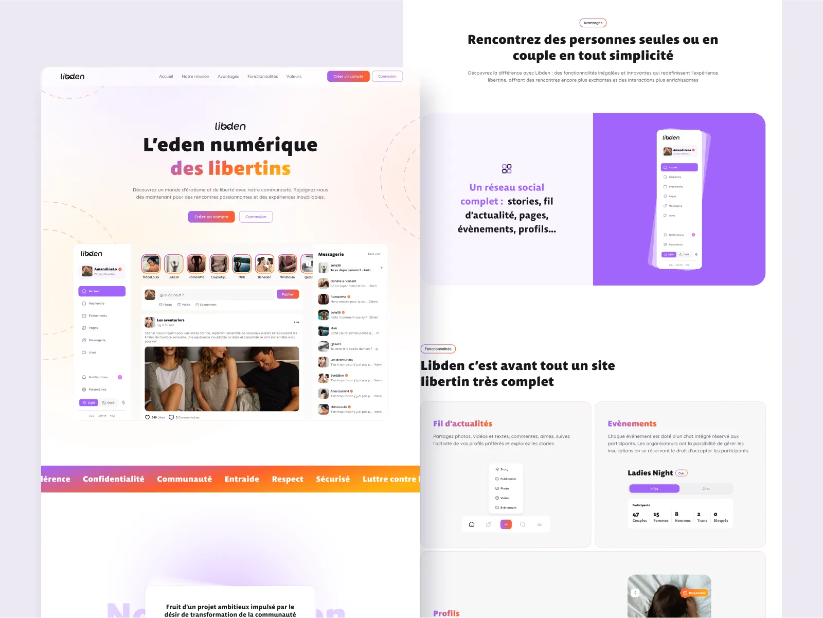
After the delivery of the project and the end of my contract with La Chouette Company, the client contacted me again for occasional needs. I therefore continued to support him on a freelance basis, adding new micro-features to the platform according to its evolution and user feedback.
The client wanted a fully-featured, polished v1 on the scale of Facebook or Instagram, on a very small budget, he hadn't fully grasped the size of that ask. During the design phase, he hired a developer for less than continuing with my team at La Chouette Co would have cost. That developer ended up rebuilding the design from scratch, because it didn't fit the technology he was using, and development moved slowly from there. I had no direct contact with the engineering team once the build started, so I couldn't help bridge that gap.
I'd insist on testing with real, external users instead of relying on the client's own circle. The "potential users" he had access to were mostly people he already knew, which biased the feedback.
Libden was born from the desire to offer a modern and inclusive alternative to existing libertine platforms, which are often obsolete and poorly functional. In collaboration with the client, we first analyzed the existing landscape and defined key features via workshops and a needs assessment. To optimize time and resources, we quickly mocked up the homepage to establish a guideline before rolling out other pages and their responsive versions. At the same time, I designed a landing page adapted to the constraints of a no-code development on Framer. After delivery, the client hired me on a freelance basis for specific updates to the platform.
 Flightlog
Slack
Flightlog
Slack