Kentyou
DATE
2025
PLATFORM
SaaS B2B
MY ROLE
Product Designer
DATE
2025
PLATFORM
SaaS B2B
MY ROLE
Product Designer
Climate decision-support for urban planning. One platform, three very different users.
PLATFORM
SaaS B2B
DATE
2025
The client asked to keep this project low-profile and not to show the interface, so everything here is intentionally anonymized. This case study sells the thinking, not the pixels.
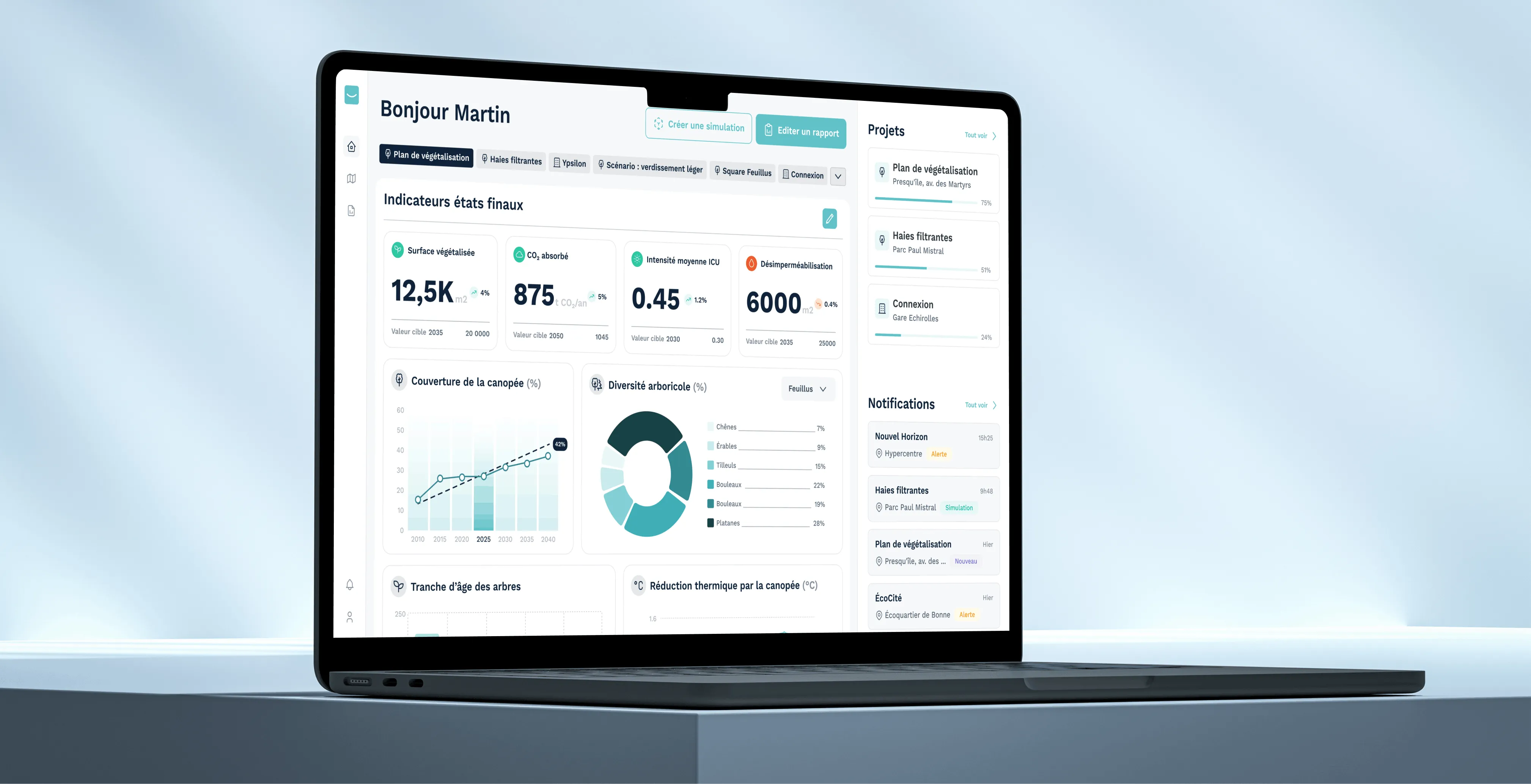
Standardized how a French metropolis tracks and simulates urban heat, on the white-label platform I've been designing for Kentyou since 2021, validated in testing and now in development for three users with opposing needs.
CLIENT
Kentyou is a company specialising in innovative solutions for smart cities. They develop Kentyou Eye, a white-label web platform tailored to the needs of each organisation, whether local authorities or private companies, helping them monitor their data and track key indicators. I've been collaborating with Kentyou since 2021 on several projects built on this platform, and this 2025 climate project is one of the most recent.
CONTEXT
Cities are heating up, and dense urban areas trap that heat far more than the countryside around them. This project was built to help a French metropolis understand that problem on its own territory: track climate indicators, simulate how a new development will change them, and use that to make better planning decisions. It ran as part of a European climate initiative, built by a consortium of four partners, where I was the only designer on the Kentyou side.
THE USERS AND THEIR PAIN POINTS
On this kind of project, the hard part is not making the screens look good. It is starting from one shared platform and adapting it to each city council, each private client: gathering their needs, their frustrations, their way of working and their goals, so the solution genuinely helps them day to day, without starting from scratch every time.
On this climate project, that constraint took a very specific shape: three completely different people had to work from the same platform and the same climate data, for opposite reasons and at opposite scales.
EVALUATION MANAGER
Evaluates a single development, tracks its impact over a 10 to 15 year lifecycle, and has to explain the results to elected officials.
SIMULATION MANAGER
Runs fine-grained simulations, testing how adding or removing trees changes local heat, on their own, without a modeling team.
DIRECTOR
Thinks about the whole territory in 2040 and 2050, and only wants aggregated trends and high-level reports.
On top of that, three constraints. The data is heavy and scientific (heat island indices, thermal comfort, canopy density, carbon storage), but a non-expert has to be able to read it. The platform is white-label, so anything I designed had to flex for this project without breaking the shared foundation used by other clients. And the experience had to move between a 2D map and a separate 3D simulation tool without the user losing the thread.
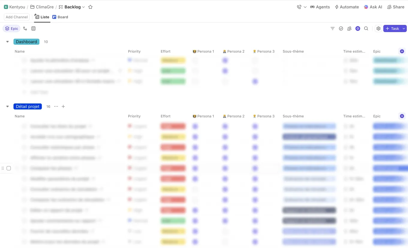
I joined this project once the initial research phase was already underway: five stakeholder interviews, three personas, and early user journeys were already done. I absorbed that work, clarified the business vocabulary, and turned it into a prioritized backlog of about 40 user stories across the three views, tagged by persona and priority, which let me challenge a few assumptions with the client early (report editing, data layers, how scenarios get created) before they became expensive screens. From there I owned design end to end: wireframes, user flows, high-fidelity UI on the Kentyou Eye foundation, usability testing, and dev handoff.
I already knew this platform well: I had tested it with real users on other deployments, for other local authorities and other subjects. The project view was different there, but the UX foundations were the same.
Collaboration and team: I worked as a Kentyou contractor, with no direct contact with the client city. The lead developer sat in on every meeting; sign-off came from the lead developer, the product owner, and Kentyou's founder at each milestone.
One backbone instead of three products.
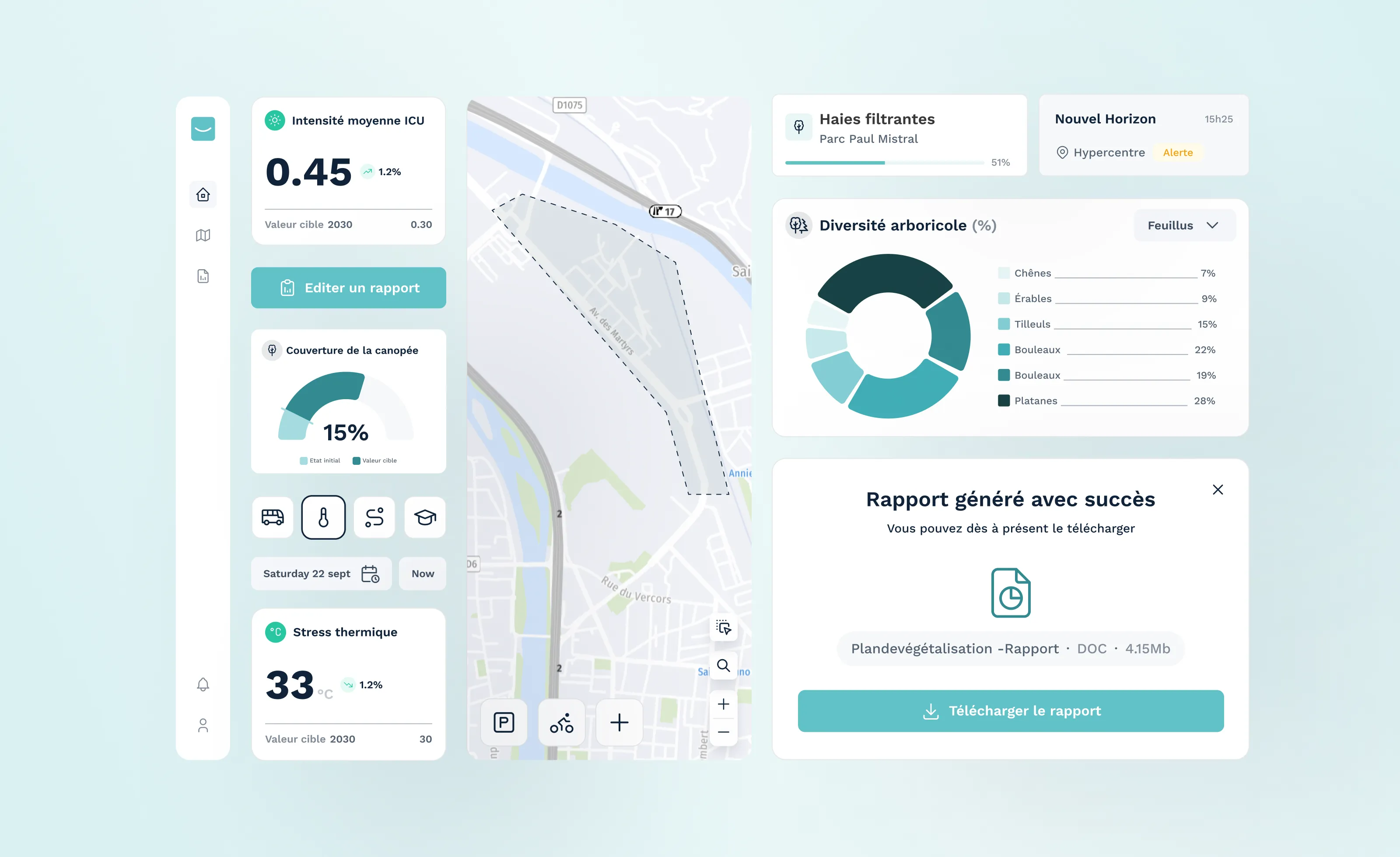
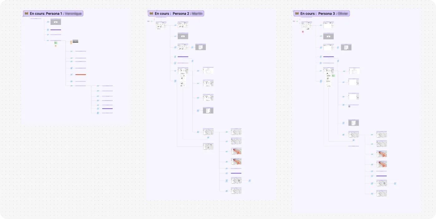
I had three personas pulling in opposite directions. Instead of building three products, I gave the platform a single backbone: a project list, a project detail view organized by phases, a 2D map view, and a path into 3D simulation. What changes between personas is the entry point and the emphasis, not the structure. The evaluation manager comes in through projects, the simulation manager through a theme or a geographic zone, the director through territory-wide indicators. Same building blocks, arranged around what each person is actually trying to do. This kept the product learnable, and it kept it compatible with the white-label foundation.
The feature that got the strongest reaction in testing.
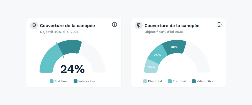
Urban projects here run 10 to 15 years, and indicators were inconsistent from one project to the next, making impact hard to follow. I treated every project as a series of states (initial, defined phases, forward-looking perspective) with the same layout and metrics throughout. That standardization made an initial-state vs final-state comparison possible, the feature that got the strongest positive feedback in both testing and stakeholder reviews, because it answers the question every user was really asking: is this project actually going to make things better?
Legibility on the surface, depth one click away.
The climate indicators are computed from satellite data and machine learning: credible, but dense. I designed them as toggleable map layers plus standardized zone/phase statistics, so the same indicator serves a technician and an elected official. The constant tradeoff was depth versus legibility, and I kept choosing legibility on the surface, with depth one click away.
My first pass at the project overview screen didn't hold up. Building the user flows took longer than expected: what the founder wanted, what users were asking for, and what the tech team understood weren't aligned, especially on how a project's versions should be represented and created. I reworked it several times before landing on something that held for everyone.
On this climate project, I ran a usability test on a clickable high-fidelity prototype with one real user on the city's side, walking through the three main views: dashboard, project, and map. The initial state / final state comparison (see "Key decisions") got the most positive feedback of anything in the tool. The rest of the feedback (on setting target values, handling several future states per project, and custom zones on the map) fed directly into the roadmap detailed in "Next steps".
This test only covered one user, but it builds on a method I already knew well: I have tested this same platform with users on other projects, for other local authorities.
I'd push for a second usability tester before final validation. One real user confirmed the core comparison feature worked, but the rest of the feedback (target values, multiple future states, custom zones) is still resting on a single perspective.