ActiveLook
DATE
2022 - 2024
PLATFORM
Mobile App, Website
MY ROLE
Product Designer
DATE
2022 - 2024
PLATFORM
Mobile App, Website
MY ROLE
Product Designer
Designing data you can read in a fraction of a second, inside a pair of glasses, while you're moving.
PLATFORM
Mobile App, Website
DATE
2022 - 2024
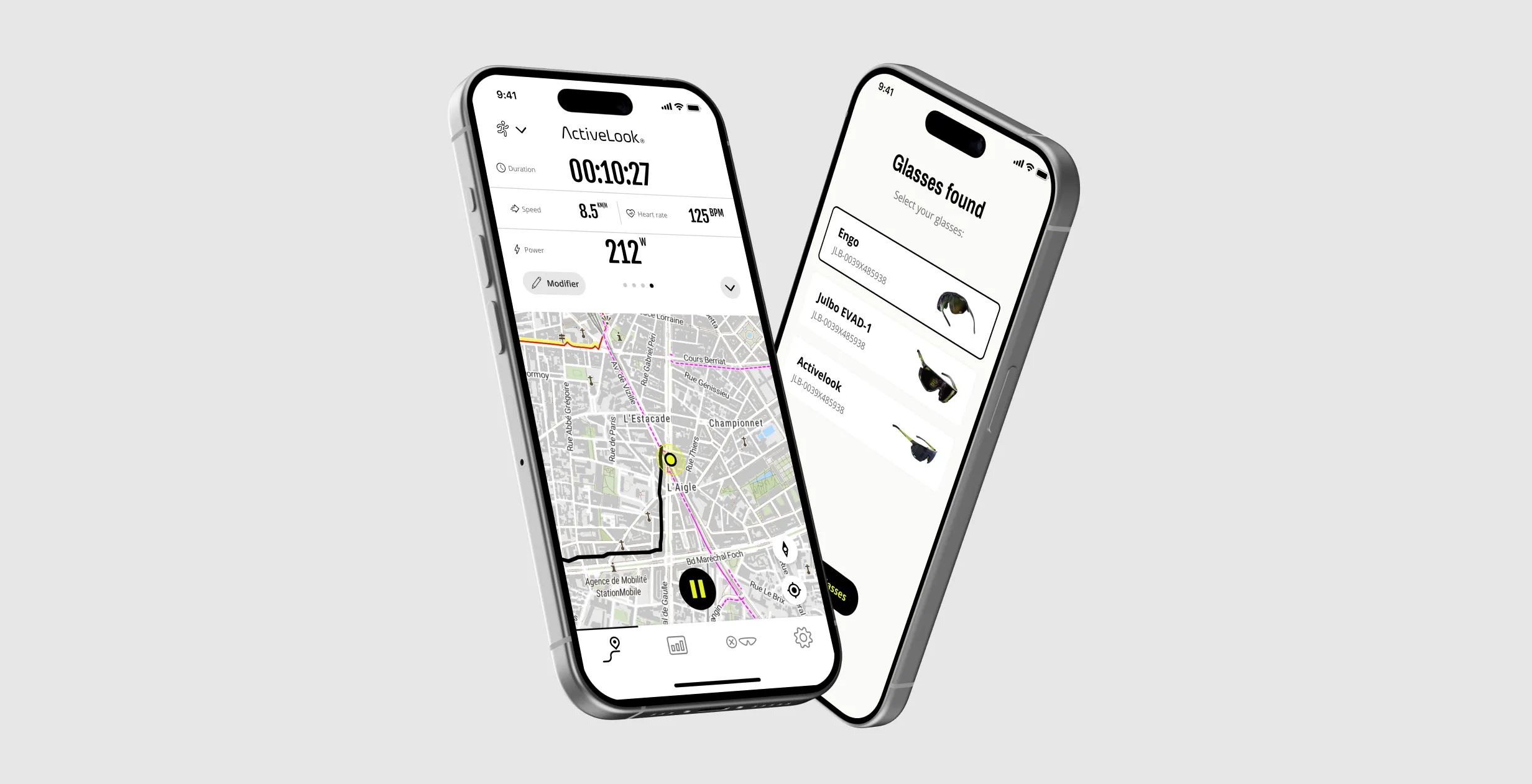
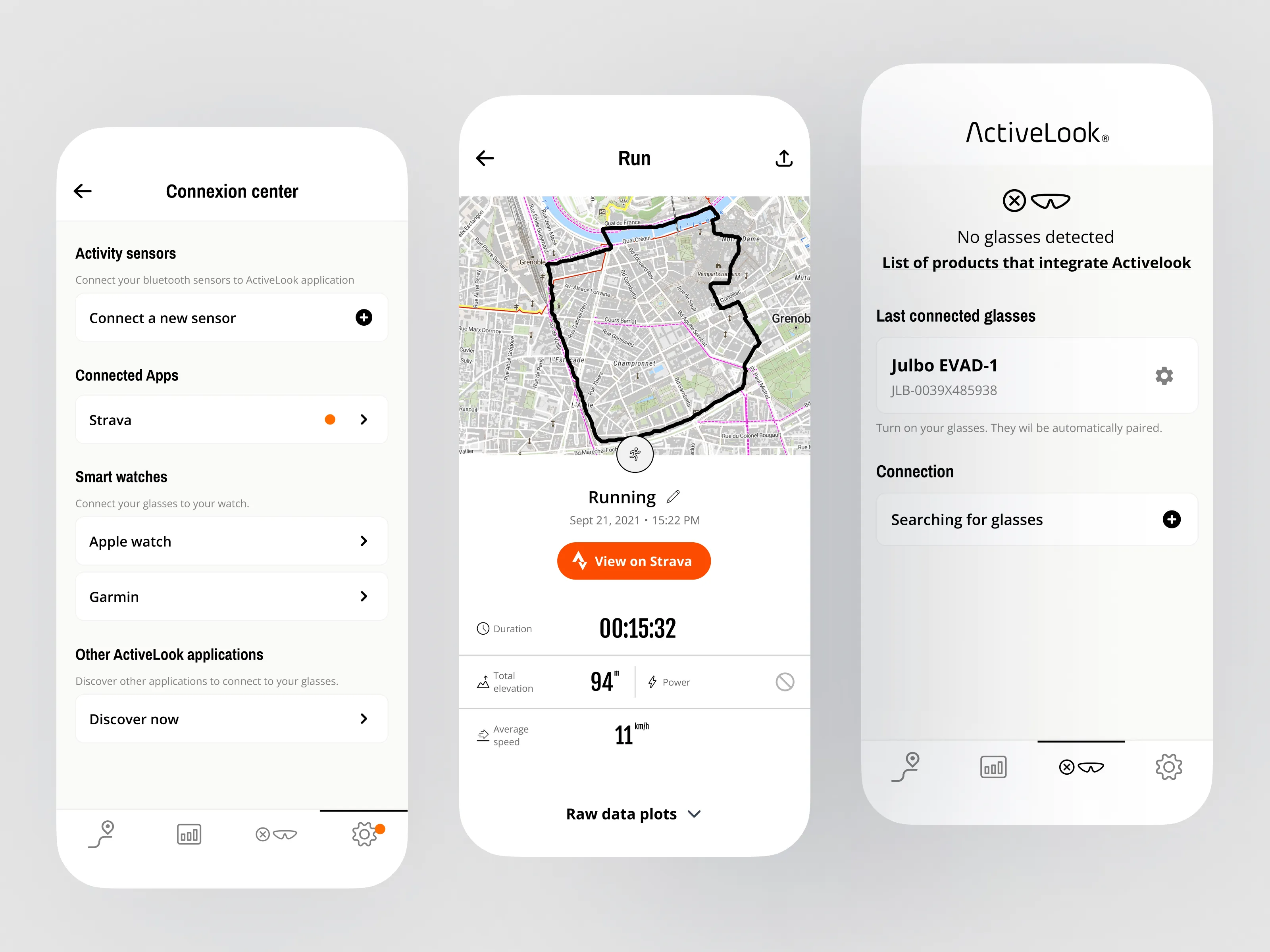
ActiveLook makes connected glasses that project real-time data into your field of vision. I designed the data-display system that became the foundation for that in-glasses experience, legible in a fraction of a second while running or cycling, across two years also covering their mobile app, website, and packaging.
CLIENT
It is an innovative company specialized in designing augmented reality technologies, primarily for smart glasses. It stands out for its expertise in miniaturization and the ability to integrate micro-OLED screens into wearable devices.
CONTEXT
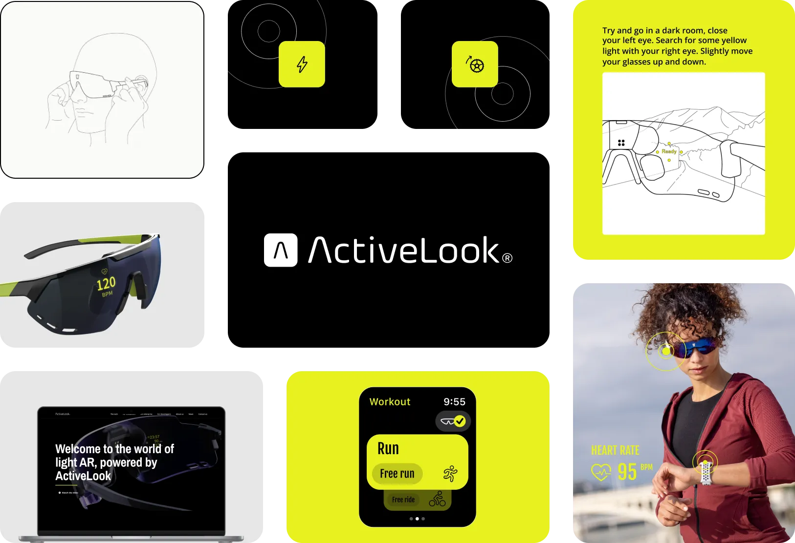
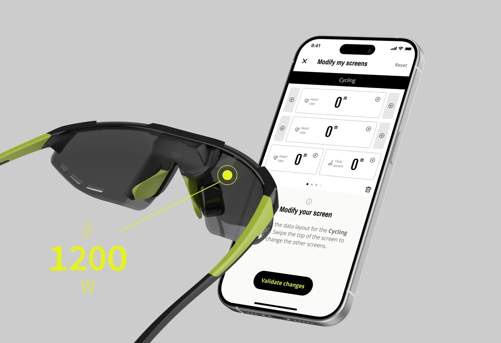
I worked with ActiveLook over several years on a range of things: their mobile app, their website, the visuals inside the glasses packaging, and the UI for the glasses. The heart of it, and the part I want to walk through here, was the system for displaying data inside the glasses themselves.
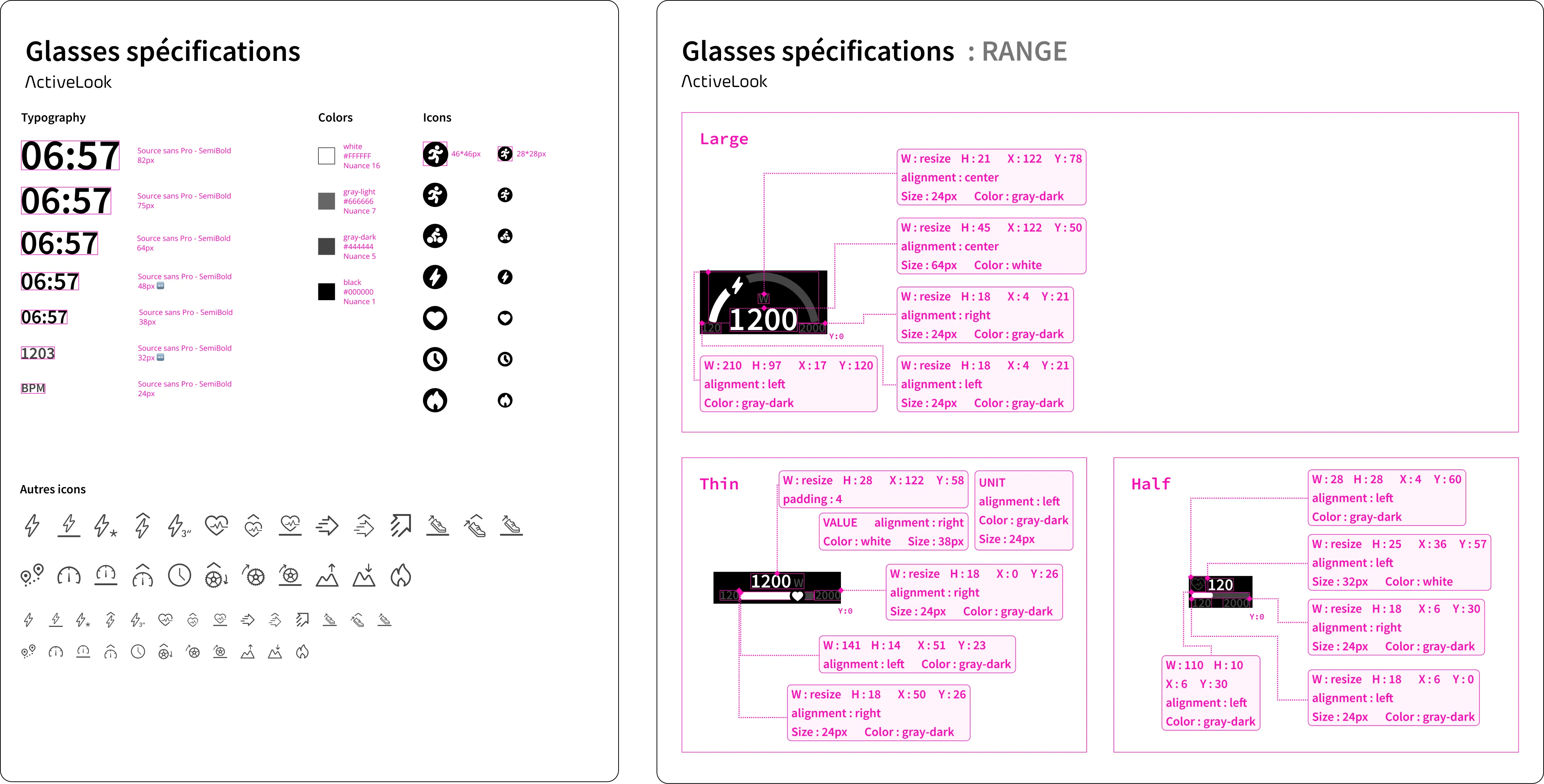
I joined to take over an existing mobile app and bring a fresh eye to it, then stayed on as the work grew. Over time I was in charge of the mobile design, the in-glasses data display, the developer specs, the website, and the printed packaging. A display this small and this unforgiving left no room for "roughly," so I worked closely with developers on detailed technical specs, exact spacing and X/Y coordinates for every element, since position was a hard constraint, not a suggestion.
THE REAL CHALLENGE
The hard part was never making a screen look good. It was that someone is reading this data mid-effort: running, cycling, moving. The display is a tiny monochrome screen in the corner of their vision. They get a fraction of a second to read it, and if they lose focus to decode a number, that's not just annoying, it's dangerous and it wrecks their performance.
So every choice came back to one rule: the data has to be readable instantly, and the layout has to be completely stable. Nothing can jump, shift, or surprise the eye.
The least obvious problem, and the one that mattered most.
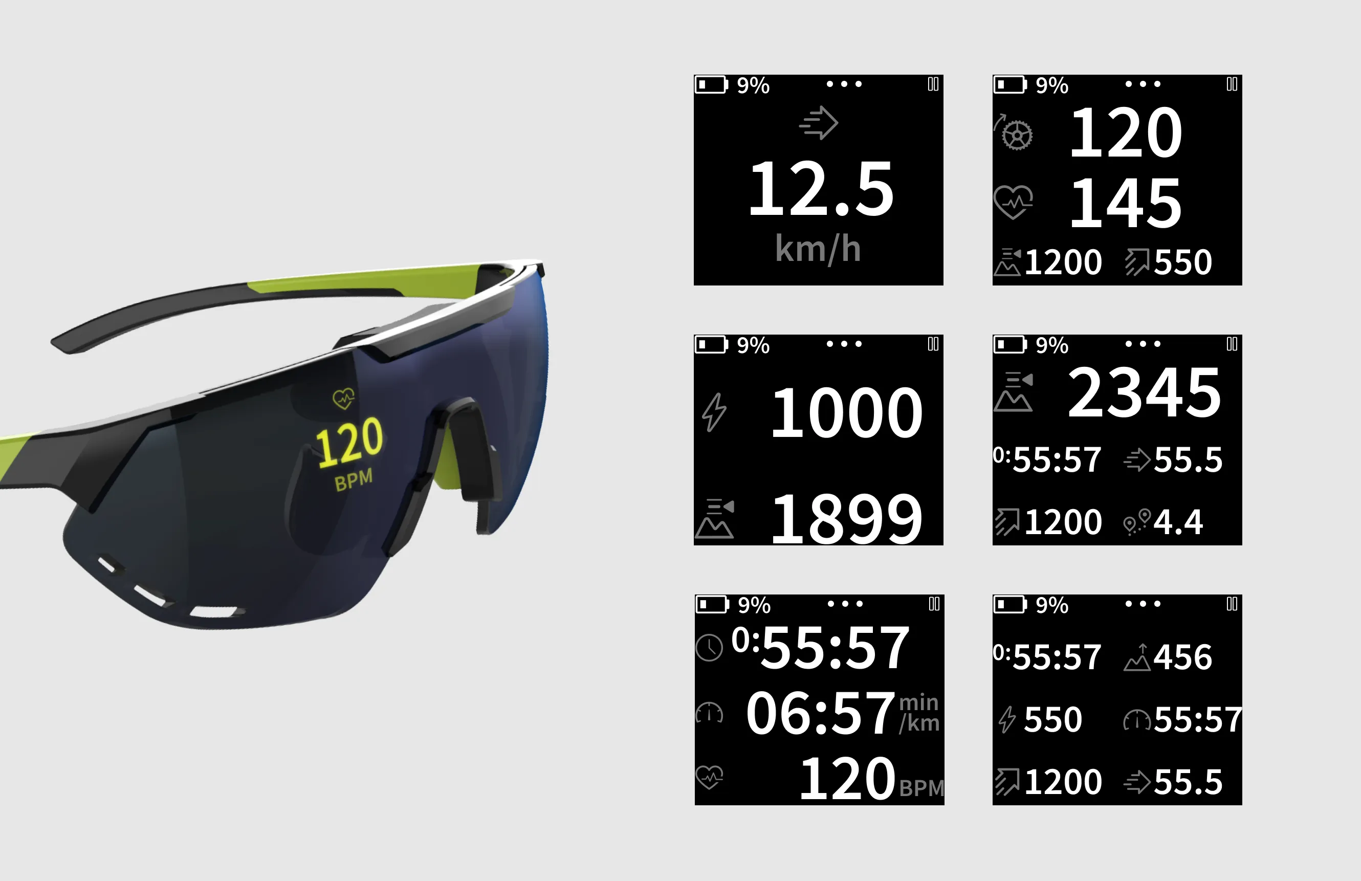
A number isn't one size. A heart rate is two digits at rest and three under effort, speed carries a decimal, distance grows as you go. If a layout is designed around the value you happen to see today, it breaks the moment the value changes, and the whole display shifts under the user's eye while they're moving.
So I designed each data type around its full range, not a single example: for every field I worked out its minimum and maximum possible value, then fixed the footprint to the largest case, so the field holds its place whether the heart rate reads 80 or 120, or speed is 9 or 14.5. The same logic extended to composition: since users pick one, two, or three data points to show in the mobile app, each layout had to keep its hierarchy and legibility at every count, instead of cramming more in and letting readability collapse.
The longest, hardest exploration.
ActiveLook wanted gamification: a way to show the user's position against a target, a ghost to race. The tension is obvious once you try it: the whole point is motivation, but anything richer than the core data competes for the same fraction of a second of attention. I ran an extended exploration on how to represent position and progress against a target without ever pulling focus from the numbers that keep the user safe. The constant answer was restraint: show the relationship, not the decoration.

At a few points I explored more visual, smartwatch-style ways to show the data. They looked good on a big screen. They lost at a glance on a tiny one. I kept choosing instant readability over richness after that, every time.
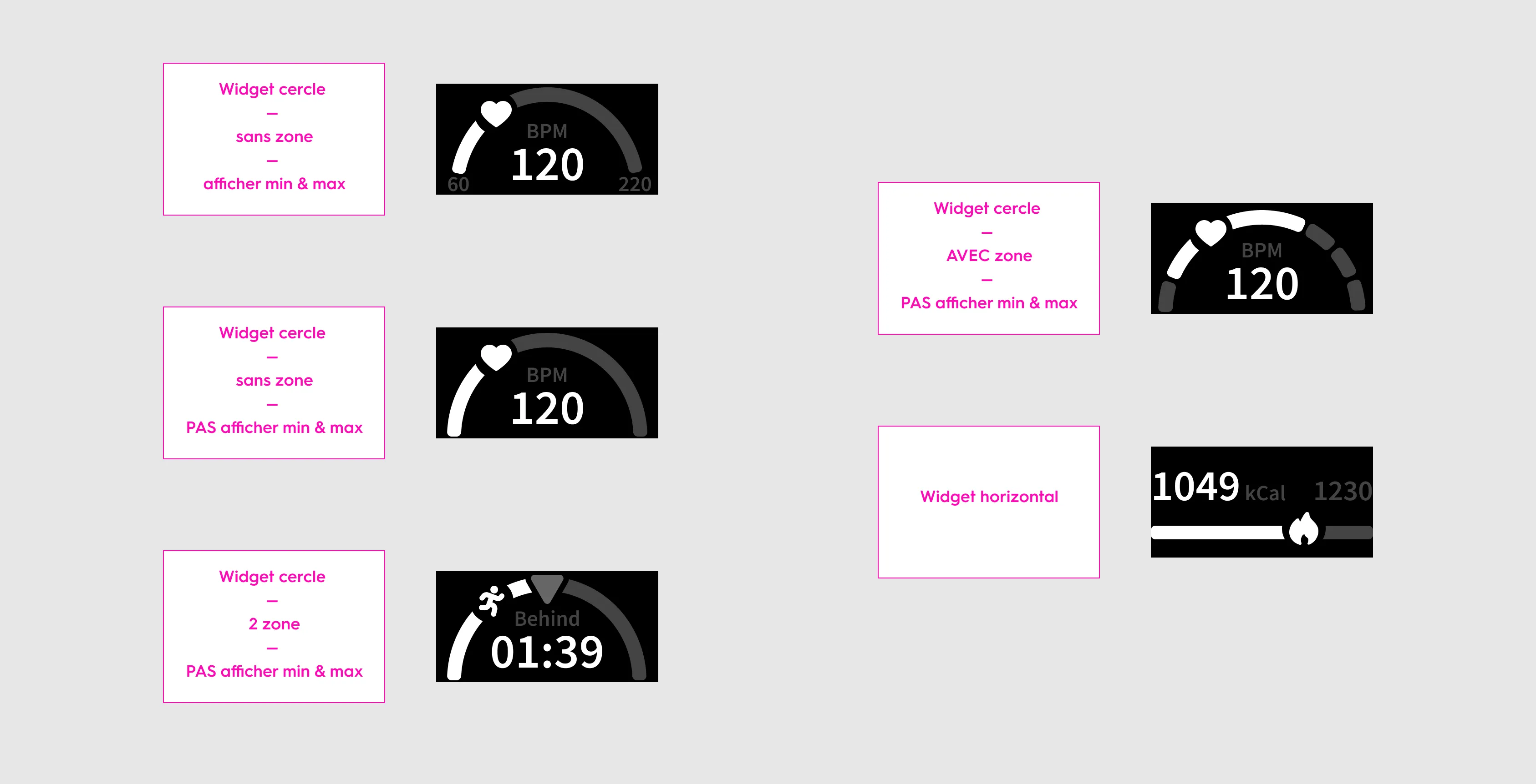
I'd time-box the ghost racer exploration harder from the start. It was the longest, hardest exploration on this project, and a clearer definition of "enough restraint" upfront could have shortened it.
Around the core work, I also handled the wider product. I reworked the mobile app's onboarding and glasses-connection flows, designed the app store visuals, ran and updated the Webflow website (designing and integrating new pages myself, given my development background), and designed the printed quick-start guide that sits inside the ENGO glasses box, sized to the packaging and laid out in InDesign.
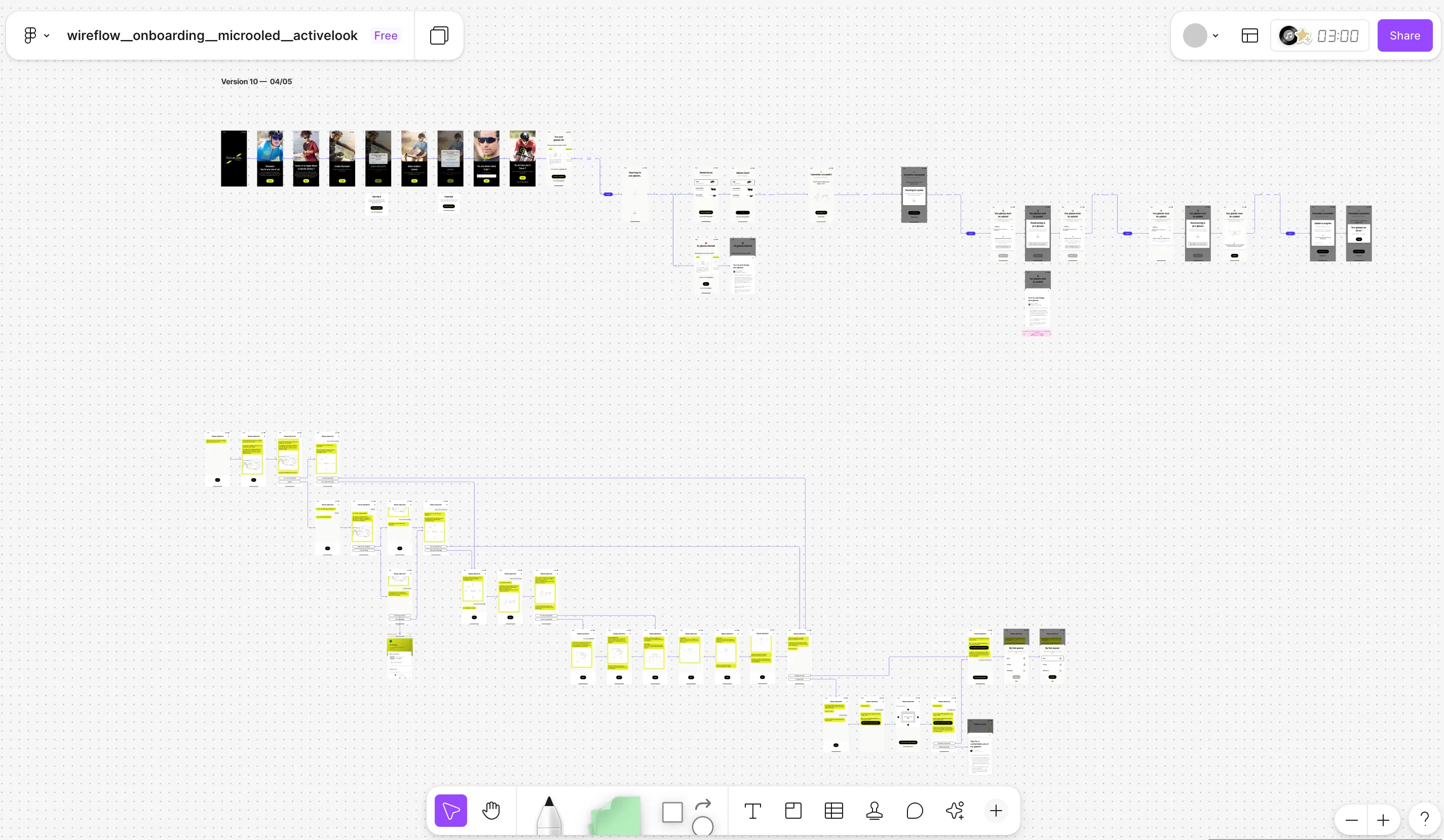
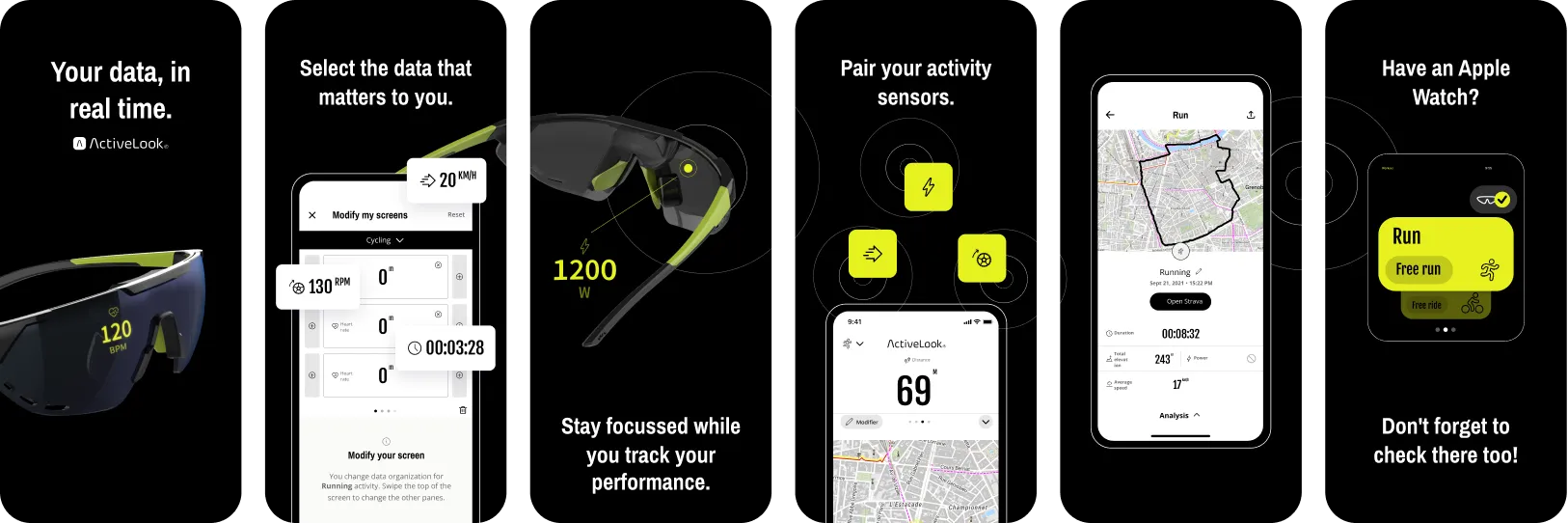
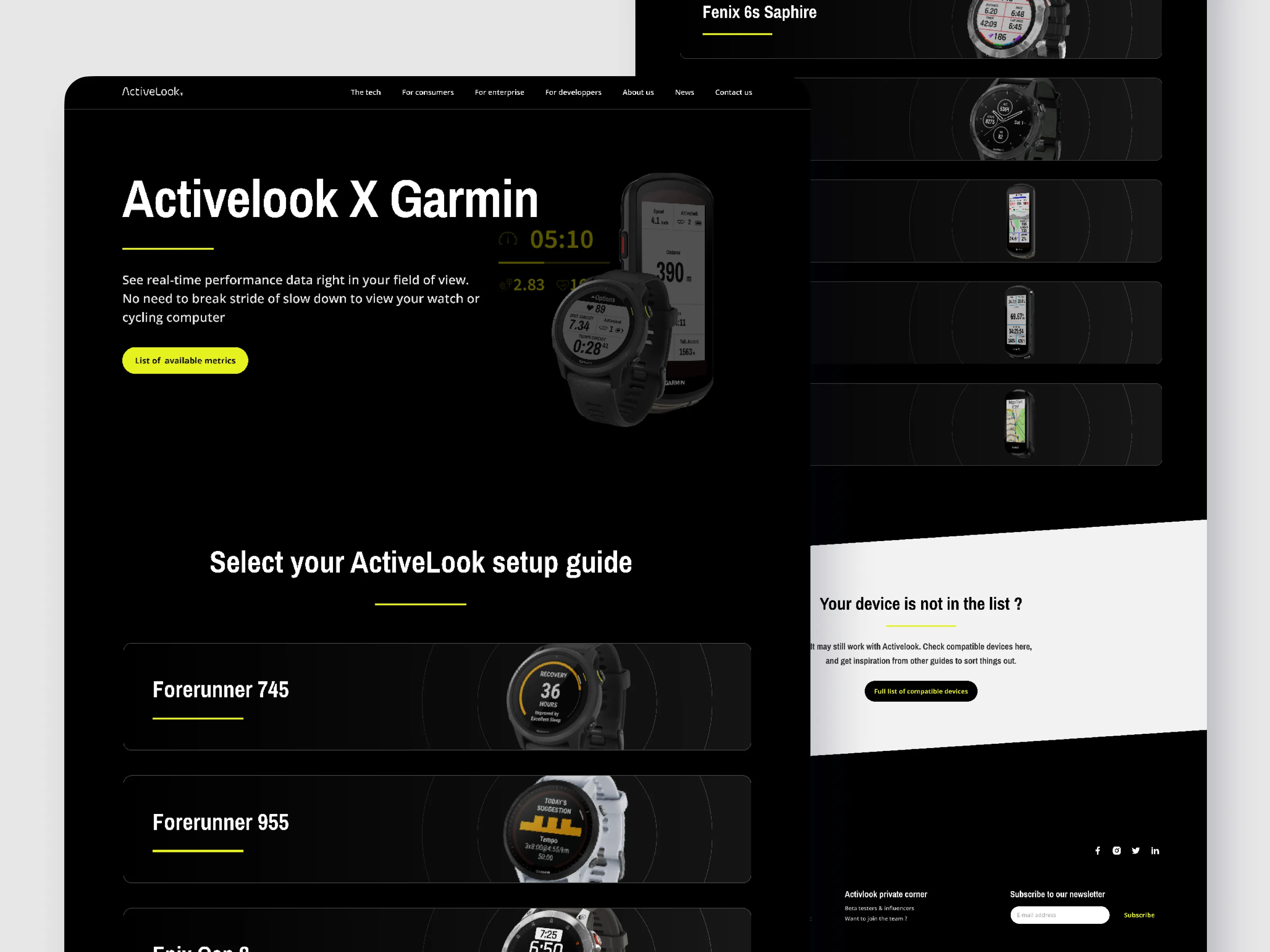
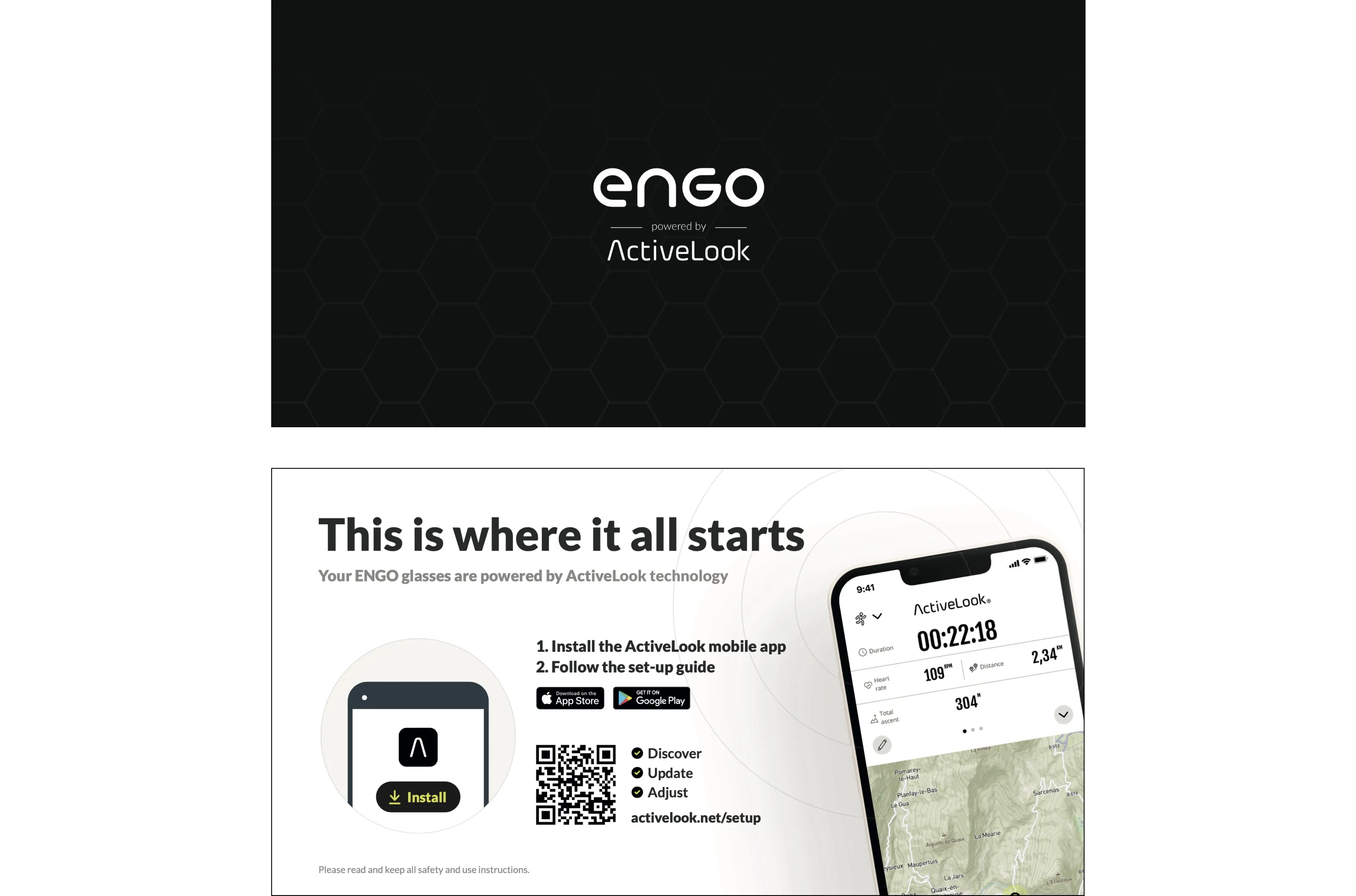
Across the collaboration I delivered a system of in-glasses data layouts, designed to stay legible and stable across every value each field can hold, plus the one, two, and three data-point compositions built on top of it. I ran the ghost racer exploration that brought gamification into the product without compromising readability, and I produced the developer specs precise enough to build it. Alongside that, a reworked onboarding and connection flow, the live website, and the printed packaging guide. The data-display system became the foundation the team built the in-glasses experience on.